West Des Moines 'Perfect' Main Floor Renovation
When the homeowners for this main floor remodel set out to get the home they’d always dreamed of, Compelling Homes was their first stop. Armed with years of industry experience, our new clients knew that our team could elevate their “good enough” home to an outstanding home. Step inside to see how we pulled it off.
The phrase “almost perfect” is a contradiction. It’s an oxymoron, like jumbo shrimp or pretty ugly; yet it’s the perfect way to describe how our clients felt about their home before we stepped on the scene.
In many ways, their home was "perfect". It was located on the perfect lot, in the perfect neighborhood, within the perfect school district. But, it still wasn’t quite their idea of perfect. The dining room — like many in and around Des Moines — was too small, the kitchen needed to be more functional, and the whole first floor yearned for a breath of fresh air.
Our soon-to-be clients didn’t want to leave their beloved home and community behind. Plus, they knew the likelihood of finding another community with a school district, neighborhood, and locale they could fall in love with was unlikely. So, they called in our dream team. We collectively decided on one of our bread-and-butter remodeling projects – the MVP, the VIP: the main floor scramble.
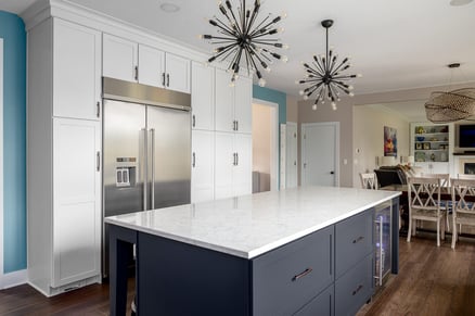
Their main asks were:
- Remodel the kitchen for ease of use
- Include a blue kitchen island
- Add new cabinetry with hidden storage
- Turn the dining room into a scullery
- Carve out space for a new dining room
- Install french doors
- Create cohesion through the main floor
Collaboration is Key
So, how do you go about making the perfect home? We believe you have to start with teamwork — and we don’t just mean hiring a team of capable design and construction professionals (although that’s a bonus).
We firmly believe that the home design process is a collaborative one and many of our designs, including this one, have benefited greatly from client input. Collaborating with new individuals also makes each design project new and exciting. That’s why we love it when clients come to us with a certain vision or idea in mind, which is exactly what happened with this project.
Our clients told us right off the bat they wanted the centerpiece of their kitchen to be a large blue island, to which our ever-excitable Rusty, promptly responded “Right on — so do I!” and immediately got to work planning.
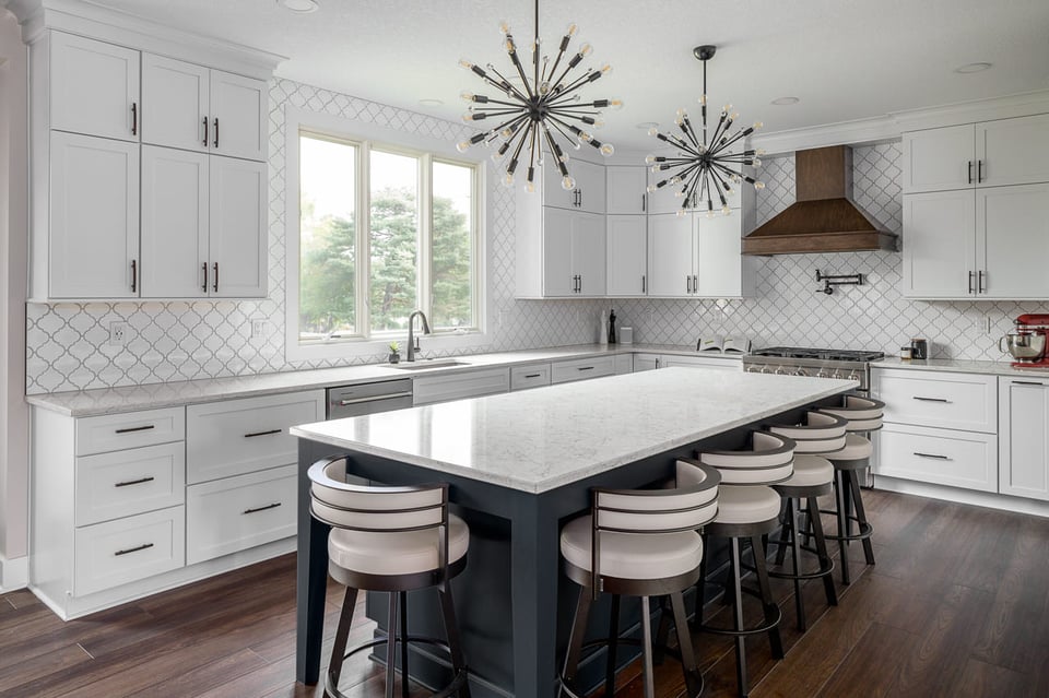
The island may be the centerpiece of the room, but the range is the visual focal point. For this reason, we decided to emphasize these features by lining them up with one another. With the runway lights on the ceiling, the island acts as a sort of arrow, bringing a viewer's eye directly to the range and creating a sense of depth that works to elongate the room.
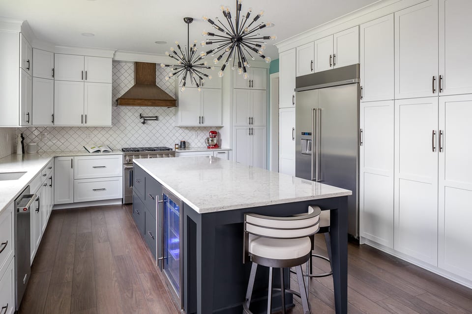
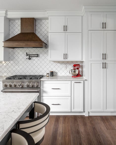
And while we love a centerpiece, we never neglect the details. The finishing touches here are the funky lights, pot filler, and arabesque tile backsplash. The backsplash creates the illusion of movement against the background, while the solid white cabinetry acts as a steady opposing contrast. Despite their differences, the two are alike in that they both employ a repetitive pattern and, in doing so, form solidarity that brings the design together.
It’s like Rusty always says, “If you have to tell someone you have a fast car, you don’t have a fast car. If you have to tell someone you have a beautiful kitchen, you don’t.” We feel the beauty of this kitchen speaks for itself.
But there’s much more to this design than just beauty.
Cool, Convenient, & Camouflaged
One could argue that the white floor-to-ceiling cabinets are underwhelming (though we’d argue they’re *refined* — especially accented by those sleek black handles). But what if we told you they were purposely designed to be minimal, plain even, so as not to draw attention? Because what appears to be simple cabinetry, isn’t cabinetry at all.
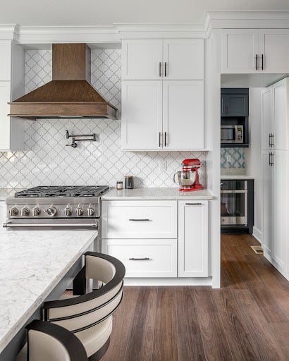
With a simple push, what might be doors to an overflowing pantry are instead revealed to be the entryway to a secret scullery. Remember the too-small dining room (common in De Moines two-story homes) we mentioned in the intro? Most people would agree those dining rooms usually aren’t large enough to eat in, so they become wasted space. We don’t like to waste here at Compelling Homes. So instead we decided to repurpose the space by adding useful storage, features, and appliances.
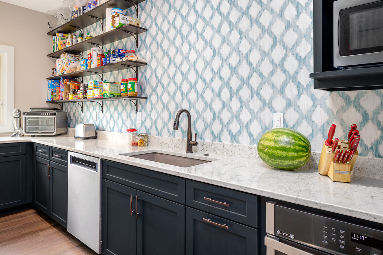
The first thing you might notice as you walk into the scullery is the bright blue and white wallpaper. We chose the wallpaper because, despite the contrast in color, it matches the pattern of the arabesque tile backsplash in the main kitchen. We draw these parallels in shape, pattern, and material to ensure continuity between the two spaces, even though they are often closed off from one another.
Along with an extra sink, dishwasher, microwave, and other appliances, the scullery offers space to store extra food or kitchen utensils. But the best part is this little party trick: whenever our clients have guests coming over, they can hide their dirty dishes, leftover snacks, and soiled towels in the scullery in the blink of an eye!
Who Said Functionality Can't Be Fun?
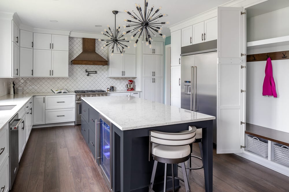
Of course, we didn’t stop with the mudroom storage. Take a look at the island. See those drawers? They’re *3* feet wide. That makes them big enough to fit your largest pots and pans. You can even fit a vertical plate rack, which allows you to maximize your space by stacking your cookware. This is an example of what makes working with a design-build remodeler like us different: we come up with custom solutions that make your spaces work for you and your lifestyle.
Next, check out the beverage cooler built into the island. The homeowners wanted extra fridge space for storing juice boxes, workout shakes, wine, beer, and other favorite drinks — so extra fridge space they got! Plus, with blue lights that mimic the island’s paint color, this functional addition looks great too. The real star of the show, however, is the column refrigerator. Our clients told us they wanted a “super sexy” fridge, and we chose to go with a column refrigerator accordingly. These high-end appliances are stand-alone fridges/freezers that give you the ability to place them wherever you want. Here, the column fridge gets an extra-sleek look by being built into the surrounding cabinetry.
Although the design of this kitchen is focused on functionality, in each facet we tried to incorporate an element of fun like the wavy tiles, colorful blue island, blue beverage cooler lighting, and most obviously, the hidden scullery and mini mudroom which add an element of surprise.
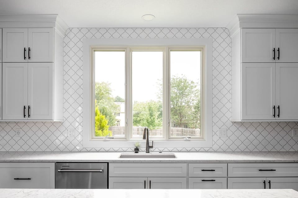
We’d be remiss if we moved on to the dining and living room without mentioning one of the kitchen’s best additions. This brand-new three-paned window, along with the surrounding cabinetry, tile, and countertop creates harmony through symmetry and highlights a great view.
Creating Main Floor Cohesion
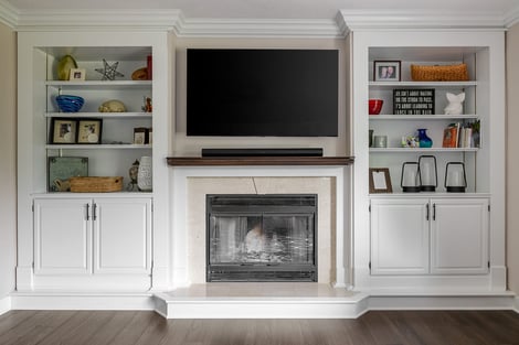
The kitchen and scullery got the most attention in this remodel, but one of our clients’ main asks was that the kitchen keeps continuity with the rest of the main floor. They, understandably, wanted their kitchen to flow seamlessly with the areas of their home that didn’t require as much remodeling. In the living room, we only needed to swap out the cabinet hardware. However, the dining room required more extensive adjustments.
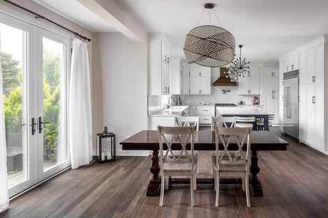
We started by focusing the room around the light fixture, formed by three interconnected circles. This statement light existed before the remodel and keeping it as the centerpiece of the room was a huge priority for our clients. We kept the rest of the room rather simple to highlight the piece and even chose the light fixtures in the kitchen to match with a similarly quirky shape and color.
The light isn’t the only thing making a statement, though. Most doors are about 6 feet 8 inches tall, but these elegant French doors stand at an immersive 8 feet tall. The doors let an enormous amount of light into the space and once again show off the scenery, which the homeowners can admire from the dining room table. Ever detail-oriented, our design-build team also lined the French doors up with the light fixture, adding even more emphasis on the piece.
Installing the oversized doors wasn’t easy — plus, adjusting anything on the exterior of a home entails a price increase — but in the end, the extra effort and investment were worth it for our clients and us too.
Once again, many of our favorite parts of this design came from client input and collaboration. We loved getting creative and finding ways to incorporate their ideas on the island, hidden storage, leveled-up refrigeration, layout, visual design, and many other key aspects. And, when we finished the project, it was amazing to see how much better their home fit our clients’ lifestyles. You could even say the fit was…perfect.
Your home — its layout, materials, and design — should suit your life. Any other kind of design is just working against you, but our capable team can fix that. Because at Compelling Homes, we don’t stop at “good enough,” we make it Compelling!


